Email inboxes are as crowded as they get these days, and standing out is the equivalent of finding a needle in a haystack. However, the key to finding email marketing success is your email header design. Think of it as painting the needle a luminous color. An email header is essential in grabbing your readers’ attention, keeping them engaged and interested in reading what you have to offer.
Email headers are not just about creating something aesthetic; they’re all about quickly showcasing your brand and message. At the end of the day, what's important is getting people to open your emails and interact with your brand.
So, how exactly can you create a compelling email header? This blog will walk you through using the correct colors and fonts, understanding your brand, and making this all work together. It will also include real-life header design examples of brands doing it right and top tricks and header design ideas to use when crafting your email headers.
The Importance of Engaging Email Header Designs
Before we give you some tips, it’s essential to understand how big a deal email headers can be. Below is a table highlighting the importance of crafting high-quality email banners and the benefits of doing so.
The first impression is what counts
The email header is the first thing people see when they open your email. It sets a tone and invites the reader to continue reading.
Increased brand recognition
Using logos, colors, and consistent themes will strengthen your brand recognition, making it more memorable for potential clients.
Improved deliverability
Properly formatted email banners with explicit metadata will make sure that your emails are not marked as spam.
Better open rates
A compelling header that has an attention-grabbing subject line is more likely to be opened than emails without this. This is an excellent opportunity to hook readers with valuable offers or information.
Tip 1: Understanding Your Brand Identity
Understanding your brand identity is arguably the most important tip. You’ll notice as you read on that everything has a solid correlation to your branding.
Your brand identity is your secret sauce that makes your brand unique, stand out, and be preferred over others. This identity encompasses everything across all your channels and should be included in your email marketing, too.
Aligning your identity across all platforms is crucial, as it helps set clear expectations for what your business stands for and builds trust with potential customers.
Email branding is more than just sending out a few messages. Your brand identity is a crucial component of your email marketing campaigns. You need to consistently include recognizable elements such as logos, colors, and fonts in your communications.
Tip 2: Utilizing Colors and Fonts to Convey Your Message
When designing email headers, the success could lie in your ability to direct the reader’s attention to the most important parts of your message. Some effective ways of doing this is through using colors and fonts.
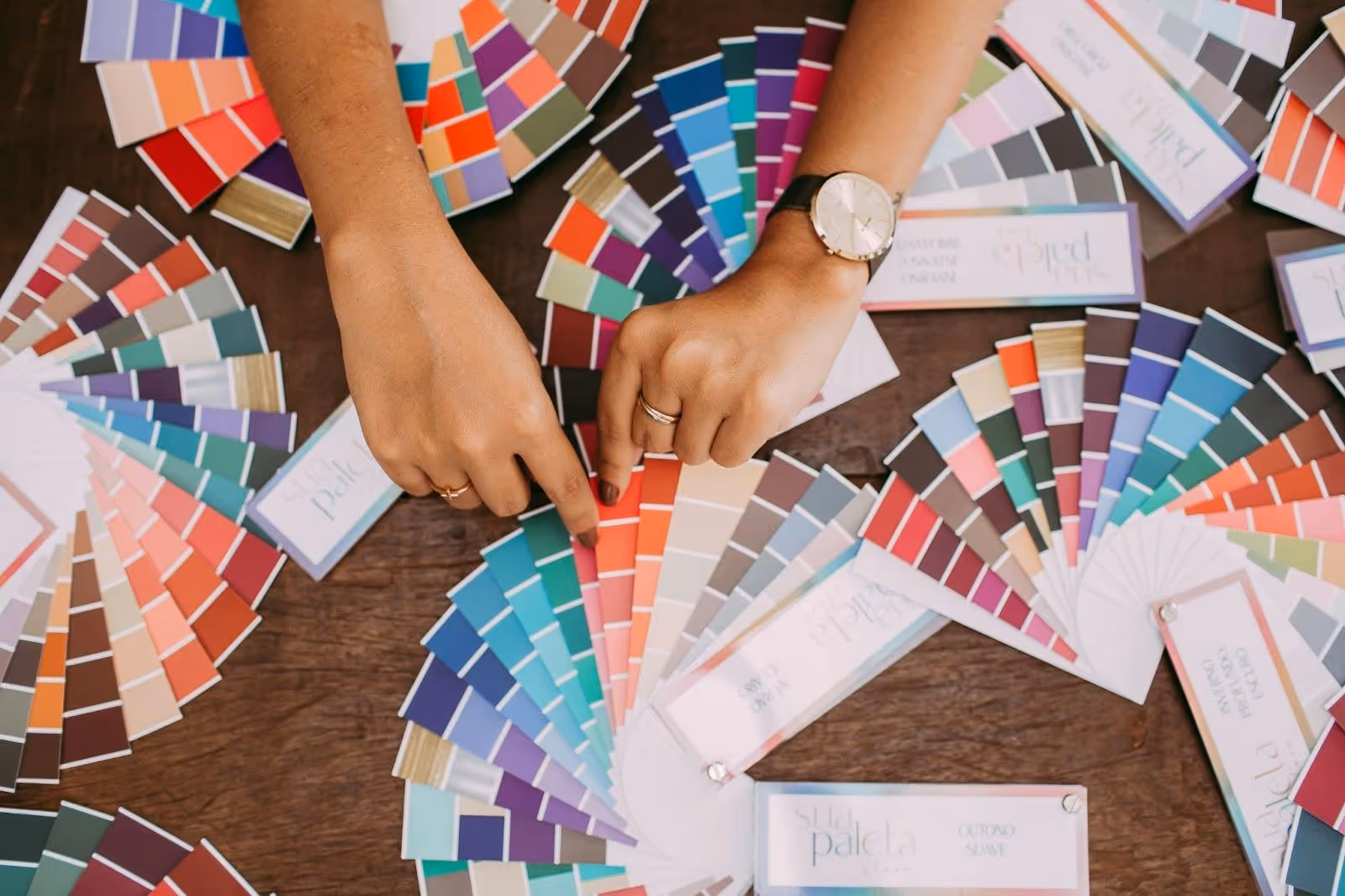
Choosing the Right Colors
Colors are often overlooked when it comes to creating email headers. However, the fact is that color triggers memories and can evoke a whole lot of emotion. Studies have shown that colors can increase your brand recognition by up to 80%. What’s even more impressive is that 85% of shoppers make purchasing decisions solely based on color. To use these stats to your advantage, follow these guidelines:
- Start with your Brand Colors: As mentioned in Tip 1, it's all about branding. Start with colors that match your brand. Choose the same colors fused in your logo and on your main website.
- Don’t Color Overload: Less is more. This is the case when it comes to using colors. Too many colors can be overwhelming. Stick to two or three main colors keeping it simple but effective.
- Consider Color Associations: Human minds associate colors with emotions. For example, red is associated with urgency or danger. On the other hand, blue conveys a message of trust and stability. Choose colors that align with the message or the offer you are conveying.
- Use Contrast for Emphasis: Contrasting colors can draw the readers eyes to important elements of your email header design. These elements could be call to actions (CTAs) or more specific headings.
Selecting Effective Fonts
Just like colors, the fonts you choose will impact the overall look and performance of your email headers. Here are some tips for selecting fonts:
- Limit the Number of Fonts: You want your design to be readable. You can make your email header more readable by using no more than two font types.
- Prioritize Readability: Some fonts might look better than others, but you should always opt for the fonts that are clean and easy on the eyes. Avoid using decorative or overly playful fonts.
- Match Fonts with your Brand: Use fonts that you are currently using on your website or blog. This could create a recognizable look or feel for your reader.
- Font Suggestions: Use serif fonts such as Times New Roman or Georgia for traditional and luxury brands. These fonts are seen as more traditional and are often used on print materials. Additionally, you could use sans-serif fonts like Arial, Verdana, and Helvetica for more modern brands. These fonts are easier to read on screens and are more contemporary.
For further inspiration on effective fonts, you might find our article on 28 Best Fonts for Your Youtube Channel in 2024 super helpful in giving you some insights.
Tip 3: Incorporating Visual Elements Into Your Email Header Design
We live in a world where images and video content have taken over. While this could be seen as a bad thing for email marketing, you can use it to your advantage. Incorporating visual elements is a powerful tool to capture attention and create a striking, memorable impact on your audience. Here are some strategies to consider:
Add Captivating Images
Relevance is significant when it comes to adding images to your email headers. Your images need to accompany your text to limit confusion for the reader. Moreover, the images you use need to be of top quality. Avoid using generic or stock images. Keep your images on brand.
Using Animation and GIFs
Sometimes, it takes a little movement to get your reader's attention. You can add some movement by incorporating visuals such as animations or GIFs. For example, a countdown timer animation under your offer. This will create urgency and draw the eyes to the offer. Graphic design services can provide you a steady output of on-brand animations and GIFs that you can include in your emails.
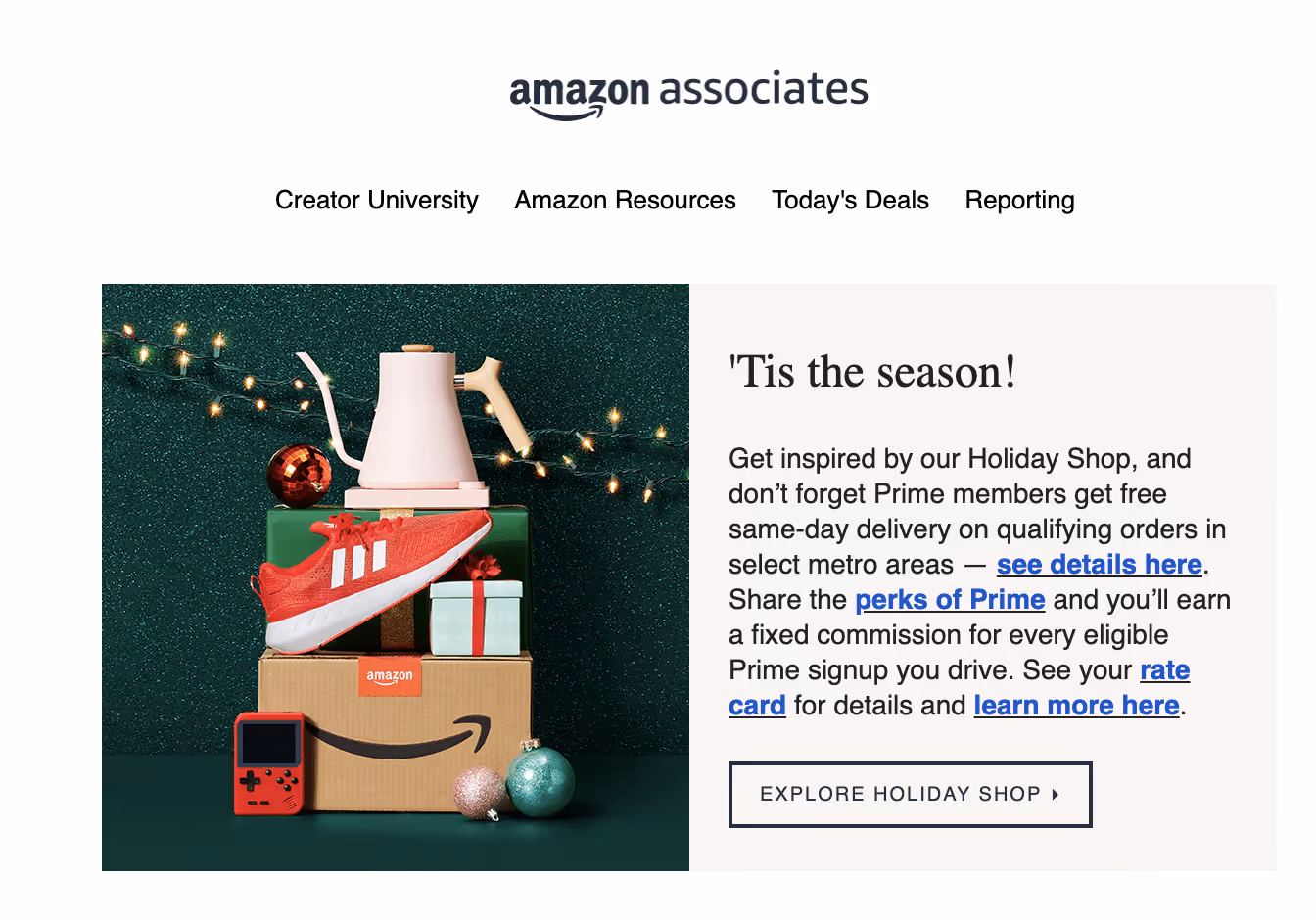
Tip 4: Seasonal and Holiday Theme Designs
Seasons and holidays have been used in marketing for years. There’s a reason, it works! Not only will this add a festive touch to your email headers, but it will create a sense of urgency and relevance. Here is how you can make your emails stand out using seasonal and holiday theme designs:
Use Festive Visuals
One of the better ways to add seasonal and holiday themes to your email headers are through visuals. Use festive elements such as snowflakes, candy canes or carved pumpkins, depending on the holiday you’re targeting.
For example, during winter holidays, you can use a cheerful snowman. You could even turn your mascot into a snowman.
Crafting Seasonal Messaging
Along with your festive visuals, you should craft seasonal messages. You can do this by researching holiday-themed copy or simply creating a seasonal relevant call to action.
For example: It’s back to school season. Your email header could have a message such as “Gear up for a successful school year!” You could then include a call to action such as “Shop your school supplies before its too late!”
Tip 5: Create an Email Hook with These Header Design Ideas
An email hook is simply a captivating phrase, a teaser, or a personalized offer that speaks directly to your reader's needs. While this might sound simple, it’s a gift that takes time to master. The hook is the magnet that will get the attention of the people you are targeting. Here are some types of email hooks that you can explore:
- Emotional hooks: Emotional hooks can connect with the reader on a much deeper level. This can tap into their feelings, desires, and emotions.
- Thought-Provoking questions: Using a question is a great way to spark curiosity and thought with your reader. This will ultimately lead to them reading more.
- Mind-Blowing Statistics: Use a mind-blowing statistic to entice your reader's attention.
- Humor: Most humans work all day in a not-so-exciting world. A little humor can go a long way in getting their eyes on your email.
- FOMO (fear of missing out): The fear of missing out hook might make the reader think they are missing out on something irresistible and will create urgency to read and act.
By crafting these types of hooks, you can turn your message from just another junk email into something that connects with your reader on a deeper level. This almost always leads to a reaction.
Tip 6: Optimizing Email Banners for Mobile Users
Nowadays, most of your readers will be viewing your emails on mobile devices. Unfortunately, mobile devices display content differently compared to that of desktop.
The main reasons are smaller screen sizes and touch interfaces. It is vital that you take this into consideration. Here are some design elements to aid you in your quest to make mobile viewing better:
Design Elements to Enhance Mobile Readability
- Font sizes and types: Use larger fonts to make them more visible and aid in readability. Recommended sizes are 17-22px for body text and 22px or more for headlines.
- Button Sizes: Your clickable elements need to be large enough to tap. Your clickable buttons should be a minimum of 44x44 pixels.
- Image considerations: Use high quality images but be sure that the file sizes are small enough to load quickly on mobile devices.
Tip 7: Leveraging Professional Help
Designing email headers means you have to be a master of many different skills. If you're not confident in creating perfect designs, they might not have the impact you need.
If you're feeling unsure after reading this blog, think about bringing in a professional design team. Your email marketing design should be seen as an investment, not just a cost.
A great email can really transform your business, so it's worth getting it right!
How to Make an Email Header
Suppose you’re feeling confident enough to try. It’s time to use all the tips and tricks for your email header design. Below is a step-by-step guide on how you can create and design your email headers:
Step 1: Define your Goals and Branding
Here you would incorporate your brand identity and choose your color scheme, visual elements and the message you want to convey.
Step 2: Design Service, Platform or Program
Choose a design service, platform or program to create your email banner on. Some popular options are Adobe Photoshop, Canva, Adobe Illustrator or Mailchimp.
Step 3: Determine the Correct Dimensions
Find out the recommended dimensions for the email header design. They sometimes vary, but a standard size is 600 pixels wide.
Step 4: Design the header
Incorporate all the elements mentioned above and create a visually captivating image that aligns with your message and brand.
Step 5: Test and Check Responsiveness
Check that the header adapts to various designs and screens. Test that it appears as you intended it to.
Step 6: Seek Professional Assistance
If this is all too much for you, and you want to ensure a professional touch, leave it to the professionals! Collaborate with top-rated design services that have the experience and creativity to tailor your design to your specific needs.
Real-World Email Header Examples
Let’s look at some email header examples from well-known brands and see how they are implementing their strategy to create effective email designs.
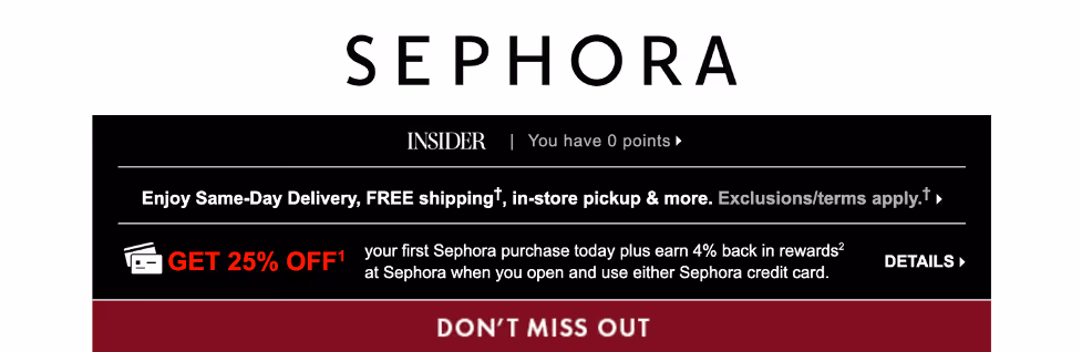
Sephora
Sephora’s email header design is a prime example of a cohesive design approach. It seamlessly transitions from the header to the main body of the email. The effective email header incorporates their brand colors, logo, and menu. They also create a hook within the header. In this case, it is “FREE shipping” and “Get 25% off” and “Don’t miss out.”
This can significantly boost engagement metrics such as open and click-through rates by conveying clear value to the user as well as capturing attention.
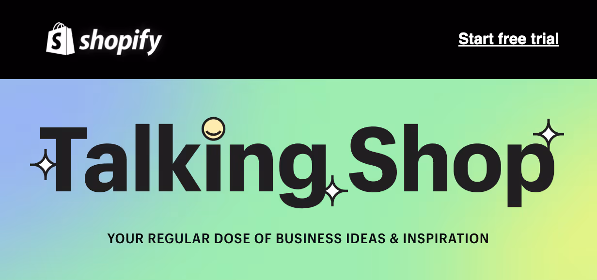
Shopify
Sometimes, simplicity can be the key to capturing customers’ attention. A reassuring email header example is Shopify. They have crafted a fun design with a catchy headline, conveying their message without overwhelming readers. Here, the header is aesthetically pleasing, to the point, and has a clickable call to action, proving a sense of ease and clarity.
Semrush
Semrush is another excellent email header example. It uses the header design as a way to announce new products. Their headers typically include their logo, a fun font, and an image. The colors chosen are consistent with their brand identity, and this consistency helps customers recognize their brand while the images and fun fonts make the content engaging.

Here is another example of how they have utilized the holiday theme to significantly boost engagement by tapping into the customers’ festive spirit. This is not only effective, but it creates a sense of timeliness and relevance.

Conclusion
Overall, an effective email header design is the cornerstone of successful email marketing campaigns and facilitates brand recognition and engagement.
By incorporating these header design ideas and looking at email header examples, you are ready to craft compelling banners that not only capture your audience's attention but also keep them coming back.
Remember to seek out professional design service help if you are not 100% certain of your skills and abilities.
Make your first impression count!